I've posted over 20 times, and this is the first time I am posting something complete.


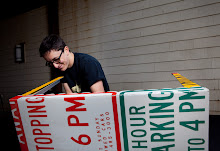
Today, I riveted traffic signs to Chair 1. You may ask, what is riveting? Let me work you through the process.
First, I drill a hole where I want the rivet to be.


The finish looks like:


Now for the exciting part-- trying to get my design posted on design blogs. I'll probably take some high quality images (non-Iphone, at least) and send them to the major chair blogs (www.chairwhore.com; www.chairblog.eu). Hopefully they will like my design and execution of the design.


The chairs looks comfortable and the two Lick students could star in a "METAL ILLUSTRATED: Jumpsuit Edition."
ReplyDeleteAwesome job, dj. I really like the contrasting sign colors, and how the back of the chair and the bottom portion seem to be continuations of each other, as far as color goes, with the seat breaking up the monotony. One tiny little quirk: the bottom panel, although highly functional, seems to harm the aesthetic of the chair. I feel it'd look much more natural without it. But that's just personal preference..and at any rate, sometimes you have to give up pretty for practical.
ReplyDeleteGREAT WORK.
(and congrats on the princeton prize!)
i don't know you too well, but you seem like a pretty cool person... :]
ReplyDeletethis chair is absolutely gorgeous. the upholstery is freakin' awesome!! and i like the placement of a base at the bottom, looks like it could be used for storage or something. maybe a good book or two.
keep up the good work!
i'm lovin' it.
David, this is beautiful!!! I actually like the base, aesthetically --- the interplay of colors and lines, though I understand Marienela's concern (could the base be optional?). It looks comfortable too! Amazing.
ReplyDeleteCongrats!
Maya
Thank you all for the positive feedback. The base is for functionality, and could be an optional feature. It does, however, add to the support structure of the chair (in addition to the weight).
ReplyDelete